[Article] Test out the fancy new UF theme?
- Thread starter fly
- Start date
You are using an out of date browser. It may not display this or other websites correctly.
You should upgrade or use an alternative browser.
You should upgrade or use an alternative browser.
Jehannum
Puts the "pro" in procrastination
me, in worksafe-ish:

I'm trying dark, so far I hate it but that's solely bc I don't handle change very well so I'll give it some time to grow on me like one of @wetwillie 's mushrooms
Dark works good on phone.
Light theme could be used to signal search-n-rescue plane, maybe even in the daytime so that's a nice and very useful added feature as well.
Light theme could be used to signal search-n-rescue plane, maybe even in the daytime so that's a nice and very useful added feature as well.
Mean Mr. Mustard
Always shouts out something obscene
Mr. Argumentor
I fab shitboxes and shitbox accessories.
I'm not a huge fan of the text being smaller (getting old, yo) and I like that unclicked/unvisited threads are a different color than when you've opened them.
Otherwise, sure.
Otherwise, sure.
Petunia
COVID POSITIVE FOREVER
That one took me a minute. There's a red dot, which once you see it, is a lot more obvious.unclicked/unvisited threads are a different color than when you've opened them.
Otherwise, sure.
I'm using talk to text right now . . . Light blinded me. You'll be hearing from my attorney. It's pretty fugly imo.
Why not just load up 5-6 pre-builts that are very different and let people discuss which ones are winners/losers? Xen themes take almost no room and don't shift things about like they can in say, Wordpress.
Why not just load up 5-6 pre-builts that are very different and let people discuss which ones are winners/losers? Xen themes take almost no room and don't shift things about like they can in say, Wordpress.
Mr. Argumentor
I fab shitboxes and shitbox accessories.
I see it.That one took me a minute. There's a red dot, which once you see it, is a lot more obvious.
I could go either way. The red dot does push the Hawt/Ontopic/Baby/WTF/etc tag over some, which also helps differentiate. Generally I don't look to the left of the thread title, I'm reading the title. That make sense?
Dory Berkowitz-Bukowski
Clam whisperer
Move aside @fly the god of running forums wants your postI'm using talk to text right now . . . Light blinded me. You'll be hearing from my attorney. It's pretty fugly imo.
Why not just load up 5-6 pre-builts that are very different and let people discuss which ones are winners/losers? Xen themes take almost no room and don't shift things about like they can in say, Wordpress.
Dory Berkowitz-Bukowski
Clam whisperer
Dory Berkowitz-Bukowski
Clam whisperer
Tablet darkk looks just like mobile. I dont like menu at the footer but otherwise cool
No thanks.I'm using talk to text right now . . . Light blinded me. You'll be hearing from my attorney. It's pretty fugly imo.
Why not just load up 5-6 pre-builts that are very different and let people discuss which ones are winners/losers? Xen themes take almost no room and don't shift things about like they can in say, Wordpress.
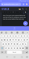
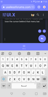
I don't know why I didn't notice it before but ya the bottom menu bar eats up a lot of screen.
Also the big round button down there on the right doesn't do anything you can't already do by just putting the cursor in a box.
Also the big round button down there on the right doesn't do anything you can't already do by just putting the cursor in a box.
He's no god, this is his first planet baby. Ancient traveler here, been site building since mid 90s.Move aside @fly the god of running forums wants your post
Share:


